


The story of our logo
Developing a brand is quite an undertaking, but when two good friends decide to embark on the journey, the work is tempered with passion and fun! Naming your business is like naming a child, in this case our own bouncing baby brand, atelierBOEMIA! We started thinking about names and the significance of the statement our logo would make about us almost as soon as we had the idea to start importing products for the home from around the world. We wanted something that represented us and the brand to everyone. After going through endless name options, we decided on atelierBOEMIA because the words alone and their international nature represent what we do. We love the idea of an atelier (French for artist’s studio) filled with Bohemian flavor, but decided to use the Italian word for Bohemian instead of the more common English one. Bohemia was actually a historical country of Eastern Europe that was composed of 2/3 of the modern Czech Republic.

Using the word Bohemian to describe the practicing of an unconventional lifestyle in the company of like-minded people emerged in early 19th century France to describe adventurers, wanders and vagabonds. We loved the combination of these two concepts together to describe our line of products as well.
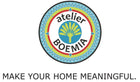
Developing our logo was the next step after deciding on our name and we wanted it to have personal significance as well. We did all the design work ourselves and went through a few different versions before deciding on our final logo:

We agreed on our favorite colors as they remind us of so many of the sunny fun filled places we have traveled, and wanted a palm tree…..what could be better than a traveler’s palm ? It was perfect ! The outer edge of our logo is a series of 2 S’s intertwined …one for Stacie and one for Séverine and a heart for our passion for the project was formed organically. Perf! The compass points represent our traveling and Bohemian spirits, taking us to the far corners of the world to bring beautiful things to your home and tabletop.

A final few tweaks of color (Hermés orange over hot pink, natch) and the lettering and our brand’s insignia was born.
When we are bogged down with lots to do at the office, we always get a little energy from looking at our logo and knowing how well it represents us and we hope you find it as pleasant, unique and symbolic of our lifestyle and brand as we do !
all pictures © atelier BOEMIA 
Leave a comment